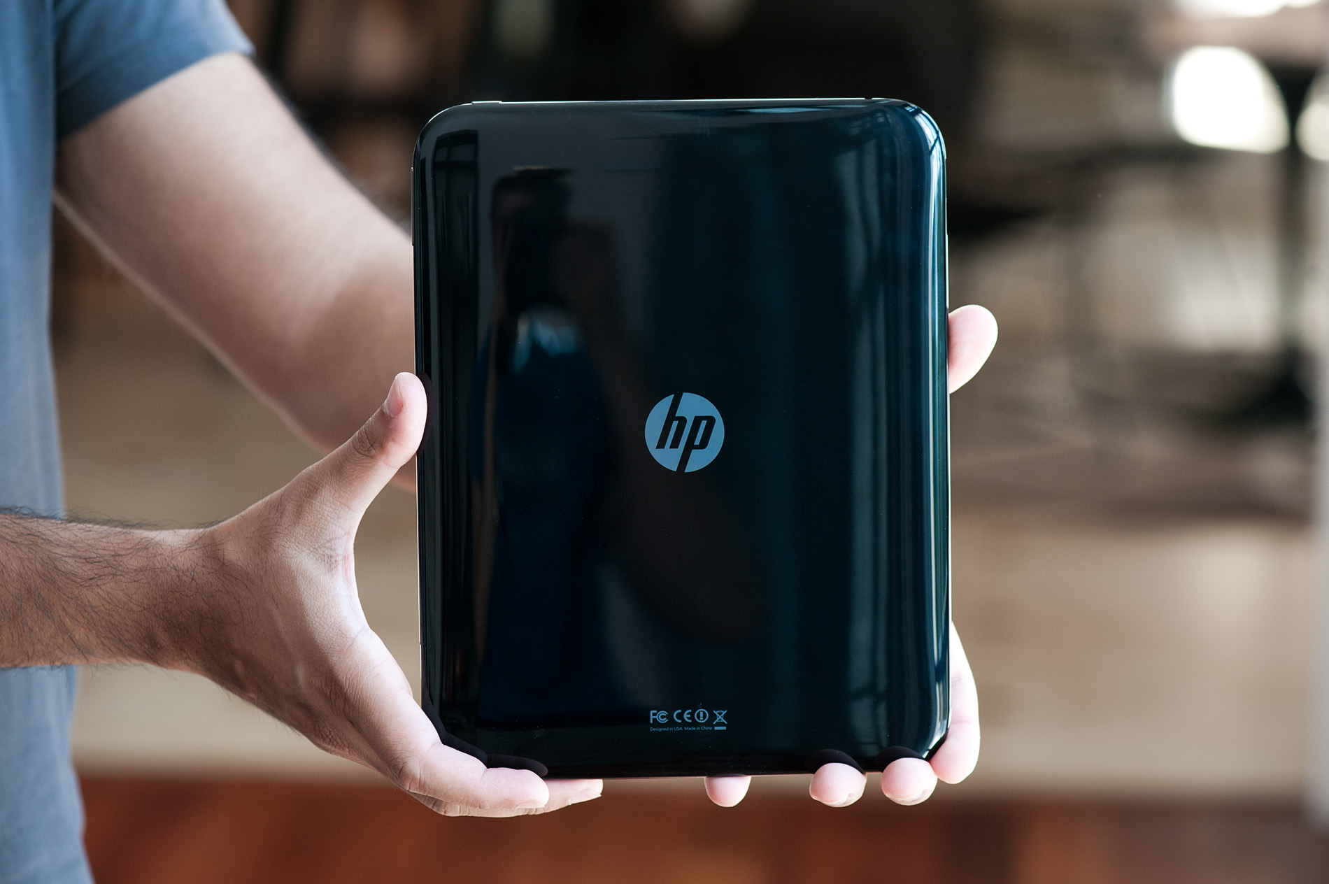
HP to Discontinue webOS Hardware, Discussing the Future of webOS
HP just announced its plans to discontinue operations on webOS devices, specifically the recently announced TouchPad and webOS phones. The future of webOS is uncertain as HP simply added that it would "continue to explore options to optimize the value of webOS software going forward". This likely means that HP is looking to either license out the software or dump it in an outright sale.
At this point I don't know that HP needs to be at the helm of the webOS project. Licensing it out could generate short term revenue from companies looking to hedge their bets against Google/Motorola, but unless HP takes on a development partner I don't know that there's much of a future for webOS under HP's command.
That leaves an outright sale. It's clear that HP wants to focus its business on the high margin enterprise space where success is a bit more guaranteed and away from the ultra competitive, regularly shifting consumer and ultra mobile markets. I firmly believe HP could have made Palm/webOS successful, but it would have to be commited to the platform for the long haul (read: 5+ years).
Who could do better with webOS? ASUS, HTC, Intel and Samsung all come to mind. The three Android partners could be interested in giving the vertically integrated route a try. As I mentioned in my review, had the TouchPad been free of bugs and performance issues it would be the best tablet on the market. Any of the three Android partners could continue to fund webOS development and leverage their hardware expertise. Unfortunately neither ASUS, HTC nor Samsung has a particularly great history of software development so any of them would be a risk.
Intel is the wild card here. After Nokia's recent unveiling of its first MeeGo phone it became very clear just how much potential the OS had. With Nokia's departure from the MeeGo partnership that leaves Intel without a hardware partner and not a tremendous need for new software. That being said, Intel has clearly expressed interest in supporting an alternative mobile OS that's truly open. An Intel purchase of webOS would at least put the project in the hands of a company that has real vision and the ability to execute it.
I feel for the folks who did the impossible at Palm and created webOS in the first place. As a company Palm just needed resources to finish its task. HP looked like the home that could provide just that but in the end it ended up being another unfortunate roadblock for what was one of the most promising OSes in the mobile space.
Unless the perfect acquisitor steps forward, I'm afraid webOS may end up being the latest casualty of consolidation in the smartphone/tablet space.
Have you tried watching high-definition (720p) movies with subtitles on your desktop computer? Well, I am certain that few of you had. But since mobile devices like smartphones and tablets are becoming popular, more and more users are using it for watching movies. Because of that, one member of the XDA Developers forum named mafiapanda posted a guide in putting movie subtitles on Android mobile devices.
The guide requires you to have an Android device (smartphone or tablet) that can play high-definition (720p) movies. You are also required to have the following: a video player named mVideoPlayer that can be downloaded from Android Market for free, enough device memory to store the movie, a USB cable, and a DVD ripping software called Handbrake. Once you have all the requirements stated above, then you are good to go. For full instructions, you can visit the forum post here and grab subtitles here or other subtitle repositories that you know.
There you have it; you can now watch your high-definition movies with subtitles on your Android device. Also, please let us know whether the guide works for you.
source


Lenovo has finally entered the Android tablet market with the 10.1-inch IdeaPad K1, which mixes innovative UI enhancements and a useful selection of pre-loaded apps with a stylish, colorful design. With a $499 price for the 32GB version, this tablet is $100 less than the Samsung Galaxy Tab 10.1 and Apple iPad 2 with the same amount of storage. But is the IdeaPad K1 innovative enough to steer you away from better-known slates?
Design
At 10.4 x 7.44 x .52 inches and 1.6 pounds, the IdeaPad K1 is quite a bit larger and heavier than rivals such as the Samsung Galaxy Tab 10.1 (9.7 x 6.7 x 0.34 inches, 1.2 pounds) and the iPad 2 (9.5 x 7.3 x 0.3 inches, 1.3 pounds). However, the 10.75 x 6.7 x 0.6-inch Toshiba Thrive felt a lot bulkier in our hands despite weighing the same amount. The tapered edges on the K1 help.
With its matte, chrome-colored side and back trim and deep red back panel, the IdeaPad K1 is one of the most attractive tablets we've ever seen. The back panel also comes in white and dark gray, but we strongly recommend the snazzy red shade of our review unit. Unfortunately, there's nothing particularly unique about the glossy front panel and the large surrounding bezel. Both the screen and the back panel are fingerprint magnets, showing nearly every touch you've made when viewed in bright light.
Display
The 10.1-inch, 1280 x 800-pixel glossy display provided sharp and bright images, but colors were not nearly as vibrant as on the Samsung Galaxy Tab 10.1. When we looked at the two tablets' displays side by side, the red bar at the top of CNN.com was a dull brick red on the IdeaPad K1 and a lighter, more orangey red on the Galaxy Tab 10.1. However, edges of objects seemed a bit sharper on the K1 than on the Tab.
Viewing angles were solid on the K1; we were able to watch a movie without significant color degradation while the tablet was sitting on a table a few feet away from us and when we viewed it from 45 degree angles. However, the glossy panel kicks back a lot of ambient light.
The capacitive digitizer was highly responsive to our swipes and taps--most of the time. Multitouch gestures such as pinch-to-zoom also worked smoothly.
Keyboard
The Lenovo IdeaPad K1 features just the stock Android 3.1 Honeycomb keyboard with no special features. Typing on the keys, particularly in landscape mode, was quick and easy. However, we wish the K1 offered haptic feedback and gave us the option of using Swype, which lets you type by tracing the letters together.
Ports and Buttons
The IdeaPad K1 offers a useful selection of ports and buttons. On the left side (when the tablet is held in landscape mode) sit a power button, up/down volume rocker, a screen rotation lock switch, and a microSD card reader. Opening the card reader, which sits behind a tiny metal cover, is a huge hassle that requires sticking a paperclip into a hole next to the port.
On the bottom, long side sit a mini HDMI out port, a headset jack, and a proprietary docking port. Unfortunately, you must use the proprietary docking port to AC adapter cable to charge the tablet and the docking port to USB cable to sync with your PC. There is no microUSB port for charging or transferring data, so if you lose the cables the tablet comes with, you're in trouble.
We appreciated the large, physical home button that sits on the bezel, but wish the IdeaPad K1 also had a physical back button like the ThinkPad Tablet. A full-size USB port such as the one found on the Toshiba Thrive also would have been appreciated.
Software and UI
From its home screen on down to its Android buttons, the IdeaPad K1 features some major improvements on the standard Honeycomb interface we've seen on all of its Android 3.1 competitors. Instead of the electric-blue Tron-esque wallpaper and back/home/layers (a.k.a. task switching) buttons, the K1 comes with a rustic wheat field that reminded us of an Andrew Wyeth painting. The all-white back/home/menu buttons also have a much more down-home feel.
In the center of the home screen sits the Lenovo Launcher Widget, which features four "zones" (a.k.a. buttons) surrounding a giant globe icon. The five "zones" are Watch (default launches mSpot Movies), Email (default launches Gmail client), Listen (default launches Slacker), Read (default launches Zinio magazine reader), and Web browser (the giant globe).
Tapping the settings wheel on the left of the widget allows you to customize which apps each of the zones launches and replace the globe button with a single image or slideshow. You can also change the color of the zone buttons and turn on/off Lenovo messages which appear as a tiny "I" icon between the Email and Read zones.
We strongly recommend disabling the Lenovo messages, because they are nothing more than advertisements for movies, music, and other paid services. In fact, throughout our testing, the Lenovo message kept recommending that we buy an explicit rap album from the group LMFAO at Amazon.com. This kind of adult content recommendation would pose a serious problem for families with children.
The home screen is also adorned with shortcuts that toggle the speakers and microphone. A lock-shaped icon allows you to put the device to sleep without hitting the power button.
In the middle of the status bar sits the App Wheel button, which looks a lot like a comics-style speech bubble. When you tap it, the App Wheel appears on the right side of the screen, showing thumbnails of your six favorite apps. Swiping up and down on the wheel rotates through these thumbnails, while tapping on one launches its associated app. You can add/remove apps from the wheel by tapping the + / - icon that appears when it is active. This feature is welcome, but we guarantee that first-time Android Honeycomb tablet users will initially confuse the App Wheel with the Recent Apps button in the System bar.
As with other Honeycomb tablets, tapping on the Recent Apps button reveals a scrollable list of thumbnails for your open apps. However, Lenovo has innovated in a major way by adding "close" buttons to the corner of each thumbnail. Tapping one of these red Xs closes its associated app, saving precious system resources.


According to Bloomberg, Rovio, the Finnish company behind the game phenomenon that is Angry Birds, is seeking funding that would value the company at around $1.2 billion. Who knew a game of flinging enraged birds at green pigs could be worth so much? Well, the game is the most successful mobile app yet, and it still has many big plans ahead.
The valuation figure comes from two sources familiar with the recent discussions, who say that Rovio is considering taking a strategic investment from a company in the entertainment business. This coincides with rumors that Rovio is in talks with Zynga about possibly an acquisition or a partnership, although this is purely speculation at this point.
The funds that Rovio is seeking will likely be used for further expansion, since the company has plans to produce an Angry Birds movie as well as open offices outside of Finland and to conquer China. Back in June, it was revealed that the company has plans to open over 200 Angry Birds merchandise stores throughout China within the next three years.
Rovio has also begun development of Magic Places, which incorporates NFC and location-based technology into Angry Bird’s gameplay. Users can unlock special content by tapping NFC-enabled phones together or by traveling to certain locations. Its first implementation has been through the NOOK Color in partnership with Barnes & Noble.[via Bloomberg]

The time has come, ladies and gentlemen of the social networking internet, for Google+ to get gaming. As Google Senior Vice President Vic Gundotra says, games are a great way for us (the people of the world) to spend time with one another “and a little healthy competition never hurt anyone either.” Today Gundotra announces games for the Google+ project, as he calls it, a whole new tab being added to the top of the social networking site for access.
The games button at the top of users streams will lead them to featured games, games bookmarked, and a stream showing games your friends have played recently. This tab is also where users will find game invites and interactions of all kinds, with their main news feed still reserved for all other interactions outside gaming. This may well be the most important differentiation between games offered on Facebook and games offered on Google+, Facebook in this case looking to be the much more noisy option while Google keeps it separated.


UPDATE: a user at PCMag is one of the lucky first to have the update roll out to them, he revealing a possibly concerning page requesting permissions of the user upon loading a new game:

[via Google Blog]
If you’re looking for a desktop PC replacement that’s stylish yet powerful when it comes to multimedia performance, then you might want to consider the Acer Aspire Ethos series notebooks. The latest revamp to this high-end series features a unique detachable touchpad that doubles as a remote control and comes in a 15.6-inch model (5951G) and an 18.4-inch model (8951G). We spent some time with the larger Ethos 8951G, so read on for our full review.
The massive 18.4-inch size makes the 8951G a hybrid of a notebook and an all-in-one PC that you certainly won’t be carrying around town. It’s still less hassle than a desktop PC if you ever did need to take it somewhere and it’s easier to stow away when not in use. But, most likely you’ll have it sitting pretty in your home as a media center.
Hardware
The Acer Aspire Ethos 8951G features a sleek and sophisticated design that boasts several improvements over its predecessor, the 8943G. The overall appearance is more classy and serious with dark hues and less fussy details. The lid and keyboard areas are black with a slight sheen and a brushed texture while the palm rest and keys are a more fingerprint-proof matte black.
The backlit chiclet style keyboard not only looks attractive, but also includes a full number pad. Its isolated keys have a good weighted feel to them when pressed. Just above the keyboard are the speakers that are now a simple horizontal band and entirely black except for a silver accent strip where it reads Dolby Home Theater. To the right side of the strip is the power button and to the left is the Launch Manager, Clear.fi, and keyboard backlight on/off buttons.
The glossy 18.4-inch TFT LCD LED backlit display features 16:9 widescreen full HD 1920 x 1080 resolution. Right above the monitor sits the 1280 x 1024 resolution webcam that’s capable of 720p HD video capture.
The detachable touchpad is probably the most notable difference in addition to the improvements in appearance and internal hardware for the 8951G. Sliding a latch pops up the touchpad so that it can be removed and used as a remote control. The touchpad has an on/off button that when pressed turns on the backlit graphical touch controls. The underside of the touchpad has a nice grippy texture for holding as a remote, but the glossy top surface gets oily finger smudges rather quickly.
The touchpad makes a handy remote control for playing movies and music, which you will be doing a lot of with the 8951G as it comes with a Blu-Ray Disc player and excellent Dolby Home Theater audio enhanced 5.1 surround sound with a visible subwoofer on the underside.
Inside, the Acer Aspire Ethos 8951G features Intel’s latest Sandy Bridge Core i7-2630QM 2Ghz quad-core processor that can be overclocked with Turbo Boost to 2.9GHz. It uses the NVIDIA GeForce GT 555M and comes standard with 8GB of DDR3 SDRAM that is expandable up to 16GB with a total of four memory slots. It has 5400RPM Seagate Momentus 750GB hard drive along with a built-in Multi-in-1 card reader that supports SD, SDXC, MMC and more.
As for connector ports, the 8951G provides many options. It offers up to five USB ports, three of which are USB 2.0, one is USB 3.0, and another doubles as both eSATA and USB 2.0. There are also ports for VGA, HDMI, Ethernet, and FireWire along with jacks for headphone, speaker, and microphone. Wireless connectivity options include Wi-Fi and Bluetooth 3.0. For security, there’s a slot for a Kensington Lock and also a fingerprint reader.
The overall chassis measures 11.61″ x 17.32″ x 1.55″ and weighs 8.38lbs.
Manufacturer Acer Product Type Notebook
Operating System Microsoft Windows 7 Ultimate
Motherboard Acer SM81_HR
Processor Intel(R) Core(TM) i7-2630QM CPU @ 2.00GHz
Processor ID GenuineIntel Family 6 Model 42 Stepping 7
Processor Frequency 2.00 GHz Processors 1
Threads 8 Cores 4
L1 Instruction Cache 32.0 KB L1 Data Cache 32.0 KB
L2 Cache 256 KB L3 Cache 6.00 MB
Memory 7.86 GB 1333 MHz FSB 1.33 GHz
BIOS INSYDE V1.04 Software & Performance
The Acer Aspire Ethos 8951G comes pre-loaded with Microsoft 64-bit Windows 7 Home Premium, Microsoft Office Starter 2010, Silverlight, Skype, Windows Live Essentials 2011, Bing Bar, Adobe Flash Player 10, Adobe Reader 9.1, and several additional items including, unfortunately, plenty of bloat ware. Those include Acer Backup Manager, ePower Management, eRecovery Management, Crystal Eye, and Video Conference Manager. All this of course made the initial boot up a bit sluggish, but the performance of the system is otherwise snappy.
We benchmarked the 8951G using Geekbench, a synthetic test of its processor and memory performance. The 8951G scored 7301, which is a good step up from its predecessor’s score of 5850. But much like its predecessor, the strength of the 8951G lies in its multitasking abilities, video processing, and gaming.
Section Description Score Total Score
Windows x86 (32-bit) - Microsoft Windows 7 Ultimate
Integer Processor integer performance 7320 7301
Floating Point Processor floating point performance 9180
Memory Memory performance 5157
Stream Memory bandwidth performance 4954
We played the Blu-Ray Disc version of the movie Avatar and found both video and audio quality on the 8951G to be excellent. The video is sharp and the movements are smooth without any juddering. The TFT LCD display has decent viewing angles from the top and sides, but sacrifices viewing quality from below.
As expected for an entertainment packed desktop replacement, the audio system is well tuned for popcorn-hour. At full volume, the sound stage is wide with great bass response and the dialogue is clear and not overwhelmed by the music and sound effects. During quiet scenes though, the noise of the air venting could be a bit annoying if you are seated very close. But the strong ventilation helped keep the notebook cool after running at full throttle for a couple of hours straight. The system remained relatively cool to the touch while warm air can be felt venting out from the side.
The touchpad is fairly responsive and has typical two-finger scrolling. For left and right clicking there is a separate physical button below. As a remote, it was able to control the notebook from as far as 20 feet away. However, 10 feet is about a good distance because any farther you’d have a hard time seeing what’s on screen. There’s a dedicated power on/off button for the touchpad that has a slight ridge around it to help you locate its position. This is because when the touchpad is turned off, the surface is completely black. Once you press the power button to turn on the remote function a backlit icon appears along with a small blue LED power indicator.
Pressing the power button again will reveal backlit icons for Clear.fi Photos, Clear.fi media mode changer, and two large icons for launching the Clear.fi Video and Music interfaces. Pressing the power button once more reveals additional backlit icons for video control buttons: rewind, play, fast-forward, stop, and volume. Holding down the power button turns it off.
The touchpad does require charging, and we can only imagine the frustration if it ever gets lost, which could very easily happen.
Battery
The 8951G is rated for up to 5.5 hours on its 8-cell 6000 mAh battery. But playing the movie Avatar at 100 percent brightness and volume at full blast after completely juicing up the battery and leaving the notebook unplugged, we were able to watch for only 2 hours and 8 minutes at which point the notebook automatically shut off with 9 percent battery life remaining. Not being able to finish watching the movie was a bit disappointing, but this shouldn’t be a huge issue since this behemoth of a notebook won’t be traveling much off the plug.
Wrap-Up
The Acer Aspire Ethos 8951G notebook is a worthy contender for your dollars if you’re looking to replace your desktop PC with something slightly more compact and portable than an all-in-one PC and also capable of delivering a high-end multimedia experience. Retail pricing for the 18.4-inch 8951G is $1599 while the smaller 15.6-inch 5951G model comes in at $1499.
At those prices, you are getting a lot of notebook for your money. The solid build, sophisticated styling, and powerful performance leave little to complain about. The detachable touchpad that does double duty as a remote control is also a nice touch, although keeping it from getting lost is a concern.


Ok guys up next on the chop block we have the LG Thrill 4G with its pretty glasses-free 3D screen and dual-core power. You may know it better as the Optimus 3D as this is a glasses-free 3D device loaded with fun. Between dual cameras and the dual-core cpu you will have plenty to do with this beast. Full details as well as hands-on video are below for your enjoyment.
Just a few days ago we did our hands-on and unboxing so feel free to read up on that here. To get us started here is the video below.
LG Thrill 4G Hands-on and unbox

Hardware
The hardware is elegant and simple in design but bold with what lies underneath. The dual-core 1 Ghz TI OMAP 4 CPU, glasses-free 4.3″ display and dual 5 MP cameras on the rear are the treat with this baby. Also powering the Thrill 4G is Android 2.2 with an included 8 GB micro SD card for storage. LG is calling this the first device on their “Tri-Dual” architecture. What that means — dual-core, dual-memory, and dual-channel. It features true dual-channel RAM to help speed things along and keep all that 3D goodness smooth and pretty.
Now on the left side of the device you have the micro HDMI-out then the micro USB port for charging/sync and they are nicely protected with easy to remove covers.

Over to the right we have barely noticeable buttons to keep the design simple. There is the volume rocker and then that all important 3D button that brings you instantly into the 3D selection page.

Then up top you have the 3.5mm headphone jack, noise cancellation pinhole, and the power/standby button. The buttons all feel nice and are easy to touch, the EVO 3D buttons were squishy and difficult at times. (EVO 3D left, Thrill 4G right)

The rear has a soft coat plastic that helps it from slipping and the front top and button bezels are like a brushed aluminum, it looks and feels nice and has a good even weight in the hand.

Software & Performance

Like mentioned above we come in running Android 2.2 Froyo but hopefully it will see 2.3 Gingerbread soon. It has a light user interface overlay courtesy of LG that looks similar to the Samsung TouchWiz and overall it’s not very intrusive and doesn’t seem to slow down or lag the device like some other UI’s. Pre-installed apps I’ll start right with the good stuff and that is 3D. We have a 3D camera, 3D gallery, 3D games, 3D guide to help out, Asphalt 6, Gulliver’s Travels, Lets Golf 2, Movies, and NOVA all in 3D for you to enjoy.

Other pre-installed apps include Amazon kindle, Live TV, Qik for video chat, AT&T barcode scanner, Polaris Office, and Yellow Pages. Not too much bloatware as most of it has uses or is 3D related.
Regarding performance I have ran a few benchmarks including Linpack, Quadrant, and Vellamo for the browser and network performance. Linpack scores were extremely low but Quadrant and Vellamo lined up nicely with other dual-core phones available but was behind the EVO 3D in Vellamo. Here are some results below.


Then the poor linpack score, but it’s always scoring higher on Qualcomm devices.

While benchmarks reveal some information they aren’t all the news. If you’ll look over the Quadrant result you see the I/O and 3D score is much higher than other devices. This is thanks to the Tri-dual technology in the LG Thrill giving great I/O performance as well as top quality 3D output.

Camera & 3D

This is where things get interesting, Welcome to the 3D party LG. The cameras on the rear are both 5MP so only record in 720p rather than 1080 but they do give you some great 3D video and image captures. Having the 3D show up on screen wasn’t the easiest task but here are a few shots so you get an idea, but don’t take these as actual results because it looks far better in real life.


As far as the regular camera, it works great for being only 5MP and the quality was great but low light we had more noise than expected. Here are a few test images with the regular camera below.

A little bit of noise and fuzz here but the room had pretty bad lighting.

Even though I don’t usually test the video capture unless its 1080p we gave it a small test run just to show my always helpful puppy has some ball skillz. Now that the lockout is over for NFL I’ll try and get him signed as he catches everything I throw his way.
Battery
With a 1540 mAh battery under the hood we can expect to see average daily usage. Many phones from HTC including the myTouch 4G, Sensation 4G and others all come with a similar sized battery. From my initial tests it seems even though the EVO 3D packs a huge 1730 mAh battery the Thrill 4G seems to last a good hour or more longer at least. I’ve been comparing both and will post pictures below and so far the Thrill is ahead of the small 3D wolf pack. I’m thinking the newer generation TI OMAP 4 CPU is a little more efficient and thus helping battery life.
EVO 3D Comparison

Now this is where things get a bit tough for me as both of these devices are extremely well made, have great performance and pack a major punch in the spec’s column. First off the LG Thrill gets bonus points for having not only HDMI-Out but the cable was included, the EVO 3D does not feature HDMI out. You can record 3D with the Thrill and stream it over HDMI to your 3D ready 56″ or whatever size home TV — I love it!
They are very similar in all aspects with a very close size, shape, weight, and overall feel but I personally like the Thrill 4G better. With AT&T’s great #2 in the nation service and call quality (which was excellent on the Thrill, loud and clear) along with not having an intrusive user interface like the HTC EVO I’m going to have to give this one to LG.

While the EVO 3D [see review] does get a few bonus points for the 2D/3D toggle and dedicated camera button it’s a little huge and almost just as much a con as it is a pro. The 3D performance and technology is basically the exact same in both phones so its hard to call it. I feel like the potential for a headache is not as bad with the LG but that could be due to the brightness of the display etc. You’ll just have to check em both out in stores and see for yourself.
Wrap-Up

To wrap things up I’ll go ahead and post a few more photos for everyone to enjoy. It was really quite fun working with the Thrill 4G this week or so. At first I didn’t like the covers on the ports but I’ve grown to like them and its now a preference instead of just something I’d deal with. I myself don’t own a 3D TV or I’d have tried out some 3D videos that is for sure, watching it from the device is plenty enjoyable if you are ok with just having 4.3″ of real estate.
This phone features everything a user would want in a high-end Android phone (unless 3D isn’t your thing). If you think 3D is a gimmick or a waste of space this phone is still equally as impressive and works great even if you never use the 3D aspects it has to offer. It sits right along the top of the list along with the Samsung Galaxy S II, Sensation 4G and even the PHOTON 4G we just reviewed. Now my last bit of info is the kicker, you can have this device with a new 2-year contact for ONLY $99 dollars from AT&T. They plan to sell plenty at that price so you’d better hurry. Enjoy!
The Motorola Droid 3 is the latest successor in a line of powerful handsets that have helped define Android smartphones. Like its predecessors, the Droid 3 takes on an angular physique but with thinner profile and a larger footprint. It launched on Verizon in recent weeks and although it does not support 4G LTE, it does have the advantage of being a world phone with SIM card included.

Hardware
The Droid 3 features a larger 4-inch (960 x 540) qHD display and a five-row slide-out QWERTY keyboard. Inside, it runs on a 1GHz TI OMAP 4430 dual-core processor with PowerVR SGX540, which is rated to be twice as fast as the previous SGX530 GPU. RAM remains at 512MB, while internal storage is now bumped up to 16GB, expandable with up to 32GB microSD.External ports include the usual micro-HDMI, micro-USB, and 3.5mm headphone jack. It has the physical power button centered on top, volume rocker on the side, and the standard four capacitive touch buttons of Android devices.
Camera specs have been boosted to an 8-megapixel rear-facing camera, capable of 1080p HD video capture. However, the LED flash is now replaced with a single LED that seems to do the job of the dual-set used previously. A front-facing camera has also been added, but only of VGA quality.
Software & Performance
Motorola’s customized interface runs on top of Android 2.3.4 Gingerbread. It’s no longer called Motoblur with a rather nice, clean look and some new icons along with new animations between windows. Five windows are available for adding your favorite widgets and apps, and the included widgets are nicely minimal. There is also a dock at the bottom of the screen with four customizable icons.Preloaded are around 60 apps, which include a selection of Google apps, GoToMeeting, BlockBuster, and Skype to name a few. At the top right corner is a shopping bag icon that takes you directly to the Android Market, while to the top left is dropdown menu that lets you sort and filter your apps by Recent, Downloaded, All, or any custom group that you’ve created.
Benchmark scores for the Droid 3 are decent. The synthetic benchmarking tools we used include Quadrant Pro, Vellamo, and Smartbench 2011.


Battery & Camera
The Droid 3 will last you about a day given average use. It’s 4-inch qHD screen and dual-core processor will put a drain on the small 1540 mAh battery, but if you charge nightly, then it shouldn’t be an issue.The camera quality boost to 8-megapixels is a nice bonus, offering crisp image stills and sharp 1080p videos. The below image and video were shot very close-up to some dry brush full of prickly thorns sitting in lava rock and demonstrates how nicely the camera captures all these tiny details. However, after video compression, the short clip you see below doesn’t really do the Droid 3 camera justice.

Wrap-Up
The Motorola Droid 3 is a good upgrade from the Droid 2. The overall design has remained mostly unchanged, which will be good for fans of the original that are looking for the same form factor but with boosted specs.You will especially like the larger 4-inch qHD display, a thinner profile, and redesigned QWERTY with an extra row dedicated for number keys. There’s also the better 8-megapixel camera capable of 1080p HD video capture and the addition of a front-facing VGA camera—although that will be good only for video chatting.
The new “not Motoblur” interface is clean and snappy without too many custom widgets that get in the way. Performance is excellent with the new TI OMAP 4430 dual-core processor and battery life is decent though not great.
The only gripe perhaps is that the device does not support 4G LTE on Verizon’s network. But it is a world phone with dual bands and even comes with a SIM card inside. For those hoping for a 4G LTE handset, then perhaps wait for the Droid Bionic that should arrive sometime in September. But the trade-off then will be no QWERTY and no use abroad. So it really depends on your priorities.
The Droid 3 is currently available through Verizon for $199.99 with a new two-year service agreement. Off contract, the phone is selling for $459.99.
Windows Phone 7 Series: Everything Is Different Now
 It's astounding that until this moment, three years after the iPhone, the biggest software company in the world basically didn't compete in mobile. Windows Phone 7 Series is more than the Microsoft smartphone we've been waiting for. Everything's different now.
Today, at Mobile World Congress in Barcelona, Microsoft is publicly previewing Windows Phone 7 for the first time. The brand new, totally fresh operating system will appear in phones this year, but not until the holidays. All of the major wireless carriers and every likely hardware maker are backing it, and they'd be stupid not to. It's awesome. We've got a serious hands on for you to check out, but here is everything that you need to know:
The name—Windows Phone 7 Series—is a mouthful, and unfortunately, the epitome of Microsoft's worst naming instincts, belying the simple fact that it's the most groundbreaking phone since the iPhone. It's the phone Microsoft should've made three years ago. In the same way that the Windows 7 desktop OS was nearly everything people hoped it would be, Windows Phone 7 is almost everything anyone could've dreamed of in a phone, let alone a Microsoft phone. It changes everything. Why? Now that Microsoft has filled in its gaping chasm of suck with a meaningful phone effort, the three most significant companies in desktop computing—Apple, Google and Microsoft—now stand to occupy the same positions in mobile. Phones are officially computers that happen to fit in your pocket.
Windows Phone 7 is also something completely new for Microsoft: A total break from the past. Windows Mobile isn't just dead, the body's been dumped, buried and paved over by a rainbow brick road.
The Interface
It's different. The face of Windows Phone 7 is not a rectangular grid of thumbnail-sized glossy-looking icons, arranged in a pattern of 4x4 or so, like basically every other phone. No, instead, an oversized set of bright, superflat squares fill the screen. The pop of the primary colors and exaggerated flatness produces a kind of cutting-edge crispness that feels both incredibly modern and playful. Text is big, and beautiful. The result is a feat no phone has performed before: Making the iPhone's interface feel staid. If you want to know what it feels like, the Zune HD provides a taste: Interface elements that run off the screen; beautiful, oversized text and graphics; flipping, panning, scrolling, zooming from screen to screen; broken hearts. Some people might think it's gratuitous, but I think it feels natural and just…fun. There's an incredible sense of joie de vivre that's just not in any other phone. It makes you wish that this was aesthetic direction all of Microsoft was going in. Another, sorta similar interface, in terms of data presentation, is this Android Slidescreen app, which gives you a bunch of info up top.
 Windows Phone 7 is connected in the same sense as Palm's webOS and Android, with live, real-time data seamlessly integrated, though it's even smoother and more natural. Live tiles on the Start screen, which you can totally customize, are updated dynamically with fresh content, like weather, or if you've pinned a person to your Start screen, their latest status updates and photos.
 The meat of the phone is organized around a set of hubs: People, Pictures, Games, Music + Video, Marketplace, and Office. They're kind of like uber-applications, in a sense. Massive panoramas with multiple screens that are each kind of like individual apps. People, for instance, isn't just your contacts, but it's also where social networking happens, with a real-time stream of updates pulled in from like Facebook and Windows Live. (No Twitter support announced yet, it appears—a kind of serious deficiency, but one we're sure will be remedied by ship date.)
As another example, Music + Video is essentially the entirety of Zune HD's software, tucked inside of Windows Phone 7.
A piece of interface that's shockingly not there: A desktop syncing app. If anyone would be expected to tie their phone to a desktop, you'd think it'd be Microsoft, but they're actually moving forward here. All of your contacts and info sync over the air. The only thing you'll be syncing through your computer is music and videos, which is mercifully done via the Zune desktop client.

Hello, Connected World
The People hub might be the best social networking implementation yet on a phone: It's a single place to see all of your friends' status updates from multiple services in a single stream, and to update your own Facebook and Windows Live status. Needs. Twitter support. Badly. But you have neat things going on, like the aforementioned Live tiles—if you really like someone or want to stalk them hardcore, you can make them a tile on your Start screen, which will update in realtime with whatever they're posting, and pull down their photos from whatever service. There's also your very own profile page, where you can scan your current social state and post updates to multiple services simultaneously.All of your contacts are synced and backed up over-the-air, Android and webOS style, and can be pulled from multiple sources, like Windows Live, Exchange, etc. Makes certain other phones seem a little antiquated with their out-of-the-box Contacts situation.
Holy Crap! The Zune Phone!
Microsoft's vision of Zune is finally clear with Windows Phone 7. It's an app, just like iPod is on the iPhone, though the Zune Marketplace is integrated with it into the music + video hub, not separated into its own little application. It's just like the Zune HD, so you can check out our review of that to see what it's like. But you get third-party stuff like Pandora, too, built-in here. Oh, and worth mentioning, there will be an FM radio in every phone (more on that in a bit). Pictures is a little different though, and gets its very own hub. That's because it's intensely connected—you can share photos and video with social networks straight from the hub, and via the cloud, they're kept in sync with your PC and web galleries. The latest photos your friends post also show up here. Of course, you get around with multitouch zoom and zip-zip scrolling stuff.
Xbox, on a Phone
I'll admit, I very nearly needed to change my pants when I saw the Xbox tile on the phone for the first time. Obviously, you're not going to be playing Halo 3 on your smartphone (at least not this year), but yes, Xbox Live on a phone! It's tied to your Live profile, and there are achievements and gamer points for the games you can play on your phone, which will be tied to games back on your Xbox 360.If Microsoft's got an ace-in-hole with Windows Phone 7, it's Xbox Live. Gamers have talked about a portable Xbox for years—this is the most logical way to do it. The N-Gage was ahead of its time. (Okay, and it sucked.) The DS and PSP are the past. The iPhone showed us that the future of mobile gaming was going to be on your phone, and now that just got a lot more interesting. The potential's there, and hopefully the games will be plentiful and awesome enough to meet it.

Browser and Email
Yes, the browser is Internet Exploder. And yes, the rumor's true: It won't be as fast as Mobile Safari. Not to start. But it's not bad! Hey, least it's got multitouch powers right out of the box. Naturally, you've got multiple browser windows, and you can pin web pages to the Start screen, like any other decent mobile browser.The Outlook email app makes me question how people read email on a BlackBerry. It is stunning. I never thought I'd call a mail app "stunning," but, well, it kind of is. It's the best looking mobile mail app around. Text is huge. Gorgeous. Ultrareadable. Of course, it's got Exchange support too.

Apps, Office and Marketplace
Remember what I said earlier about Windows Mobile being dead? So are all the apps. They won't work on WP7. Sorry Windows Mobile developers, it's for the best. Deep down, we all knew a clean break was the only way Windows Phone wasn't going to suck total balls.Apps will have some standardized interface elements, like the app bar on the bottom for common commands. But here's a question: Will they multitask? Um, that depends on your definition of multitasking! When we asked Joe Belfiore, the guy running Windows Phone, he alluded to live tiles and feeds as some ofthe ways that third-parties will be able to "bring value to the user, even when their apps aren't running." Which sounds to us like a big ol' "shnope," but we'll see more next month at Microsoft's developer event MIX.
The Marketplace is where you'll buy apps. Since we've got like 6 months 'til Windows Phone 7 launches and people should be excited to develop for it, hopefully there'll be plenty of stuff to buy there on day one.
 Naturally, Bing and Bing Maps are built into the phone as the default search and maps services. They're nice, smartly contextual, and very location-oriented. Bing's also used for universal search on the phone, via a dedicated Bing button. (There is no search but Bing search, BTW.) Bing Maps is multitouchable, with pinch-to-zoom. It's rich, with built-in listings with reviews and clever ways of searching for stuff. And yeah, Office! It's connected to that cloud thing, for OTA syncing and such. Business people should be happy.
Hardware and Partnahs
Another way the old Windows Mobile is dead is how Microsoft's handling partners and hardware situation. With Windows Mobile, a phonemaker handed Microsoft their monies, and Microsoft tossed them a software kit, and that was that. Which is why a lot of Windows Mobile phones felt and ran like crap. And why it took HTC like two years to produce the HD2, the most genuinely usable rendition of Windows Mobile ever.Microsoft's not building their own phones, but they're going to be picky, to say the least, with Windows Phone 7. Ballmer phrases it as "taking more accountability" for people's experiences. There's a strict set of minimum hardware requirements: a capacitive, multitouchable screen with at least four points of touch; accelerometer; 5-megapixel camera; FM radio; and the like. There are serious benchmarks that have to be met. And only chosen OEMs get to build the phones now, not like before, when anybody with $20 could get a license. The OEMs that Microsoft's announcing they're working with at launch are: Qualcomm, LG, Samsung, Garmin Asus, HTC, HP, Dell, Sony Ericsson, and Toshiba. AT&T's their "premiere partner" in the US (dammit). (Take note people! Premiere does not mean exclusive!)
Every phone will have a Bing (search) button and a Start button. Custom skins, like the minor miracles HTC worked, are now banned. The message to hardware makers is clear: It's a Windows Phone, you're just putting it together. Basically, phonemakers get to decide the shape of the phone, and whether or not there's a keyboard.
One other word on hardware, in a manner of speaking. Hardware it won't work with? Macs. Which is kind of stupid to us—a lot of the people Microsoft wants to use Windows Phone 7, like college students, have been going Mac in droves. You wanna lure them back Microsoft? Let them use your phone with any OS.
The Big Picture
Windows Phone 7 Series is, from what we've seen, exactly what Microsoft's phone should be. It's actually good. It brings together a bunch of different Microsoft services—Zune, Xbox, Bing—in a way that actually makes sense and just works. But there's a real, lingering question: Are they too late? The first Windows Phone 7 Series…phone—goddamn that is a stupid name—won't hit until the end of this year. That's more than three years after the iPhone, two years after Android, hell, even a year after Palm, the industry's sickly but persistent dwarf.History is on Microsoft's side here—we know what happened the last time Apple had a massive head start. (Update: To be clear, in computing.) Microsoft is, if nothing else, incredibly patient. Remember the first Xbox? Back when it was crazy that Microsoft was getting into videogames? It's cost them about a billion dollars and taken nearly 10 years, but now, with Xbox Live, Project Natal and their massive software ecosystem, they arguably have the most impressive gaming console you can buy. That was a pet project. Now, mobile is the future of computing. What do you think Microsoft will sink into that?
The mobile picture is now officially a three-way dance: Apple, Google, and Microsoft. The same people who dominate desktop computing. Everybody else is screwed. Former Palm CEO Ed Colligan famously said a few years ago: "PC guys are not going to just figure this out. They're not going to just walk in." That's precisely what's just happened. Phones are the new PCs. PC guys are the new phone guys.
[Microsoft]